Curbed Bids Farewell to MetroCard Machines, Designed by Masomichi Udagawa and Sigi Moeslinger

Photo-Illustration: Curbed; Photo: Antenna Design
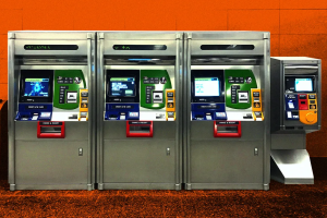
Curbed takes a look at the beloved MTA machines in NYC, designed by Masamichi Udagawa (Design ‘91) and his partner Sigi Moeslinger, which will soon be retired. Revolutionary when they debuted in 1996, the machines are a staple for New Yorkers and will be missed as people move to payments on their smartphones. As Udagawa says, what makes them so special is based on principles he learned during his time at Cranbrook. At the time, the design department was known for teaching an approach called “product semantics,” which encouraged students to redesign common household objects in expressive, often metaphoric shapes, “that was such a departure from the modernist tradition of form follows function.”
According to Curbed, the fanciful sensuality once celebrated by the cognoscenti has lived on, hidden in plain sight in a rugged machine that serves a billion or so subway riders a year. For Udagawa, and perhaps other riders as well, it is this characteristic that makes the MetroCard machine so lovable — its “subtly anthropomorphic character, with a cheerful face that appears to welcome the customer.”
Udagawa and Moeslinger have also designed the first check-in kiosks for JetBlue, the first McDonald’s self-order kiosks, the ticket-vending interface for Metro-North and the Long Island Rail Road, and the Help Point intercoms now found in the subways. They also applied their deceptively modest method of inquiry — We don’t know anything; we need to learn — to the design of several new subway cars, including the R211, the one with bright-yellow grab bars and vivid LED signage, that is currently being tested.


